Portfolio · Brand Identity
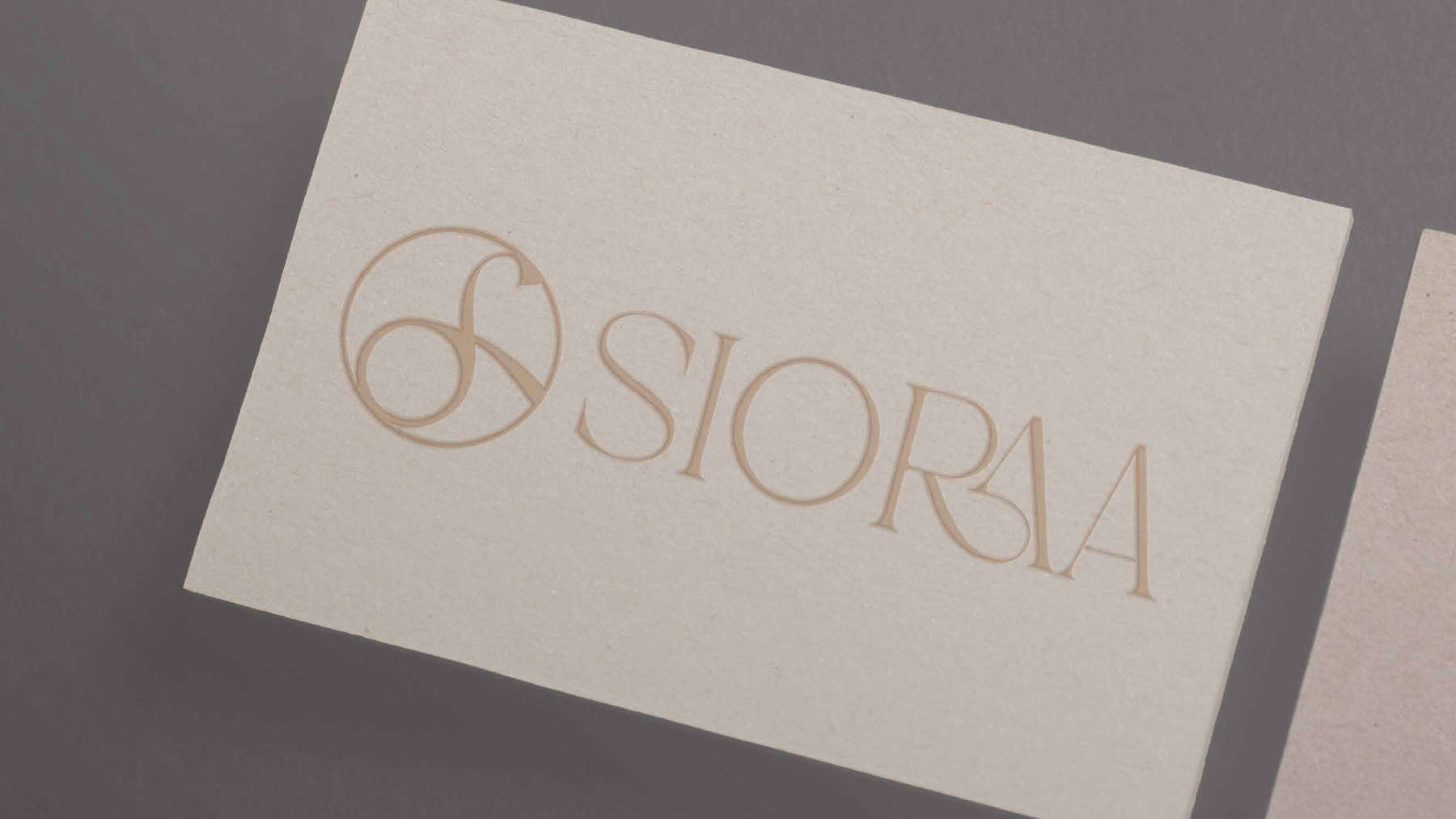
SIORAA
Furniture & Interior Design
“SIORAA resonates with bringing homeliness, comfort, and tranquility into every space through thoughtful furniture and interior design.”
The Brand
SIORAA is a furniture and interior design house built on serene design, comfort, and refined simplicity. OneDigital crafted a complete brand identity for SIORAA — a quietly luxurious system rooted in warmth, balance, and timeless form.
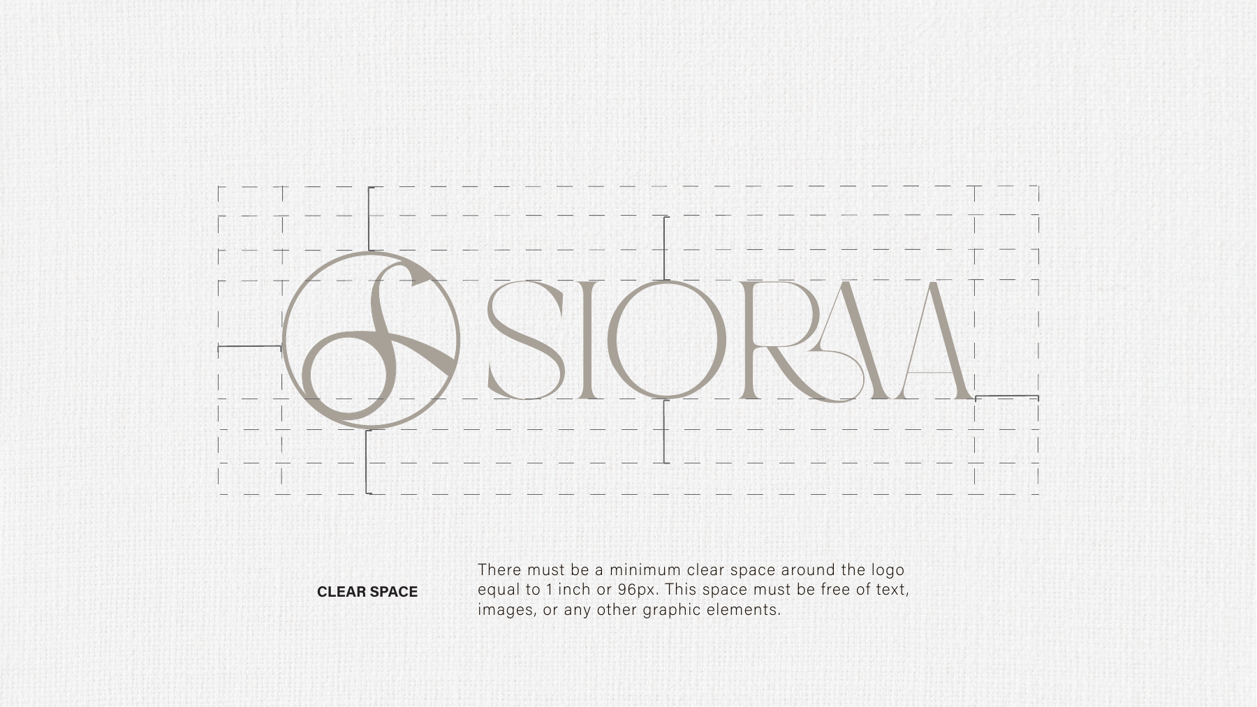
Meaning Behind the Wordmark
The fusion of the R and A in the SIŌRAA logo embodies connection — where structure meets comfort and design flows into craftsmanship, mirroring how sculpted form and soft detail coexist in every refined space.
Meaning Behind the Logomark
Wholeness
The outer circle stands for wholeness, timeless form, and harmony.
Movement
The flowing ‘S’ symbolises movement, elegance, and evolving interiors — carrying the brand and founder’s initial, Sioraa and Sonakshi.
Connection
A round table symbolises connection, subtly tying the logo to interiors and shared spaces.
Colour Palette
Soft neutrals — taupe, sand, clay, and ivory — reflect balance, natural elegance, and quiet luxury, mirroring SIORAA’s essence: serene design rooted in comfort and refined simplicity.
Typography
Applications